 Giomar Maestre
Case study · E-commerce and brand
Licendi: connecting e-commerce architecture with a clearer, more trustworthy brand.
Licendi needed to bring together a complex purchasing experience, a more understandable information architecture, and an identity capable of building trust in an international software-licensing market. My work connected UX/UI auditing, competitive review, purchasing journeys, rebranding, and responsive desktop and mobile design.
MY ROLE
Senior Product Designer — E-commerce & Brand Experience (Consultant)
UX/UI audit · Competitive review · Information architecture · Customer journeys · Rebranding · Visual system · Responsive design
CONTEXT AND RESPONSIBILITY
A commercial experience and identity that needed to speak the same language
The challenge was not simply to modernize screens. The structure needed to support product discovery, comparison, and selection, while the visual identity reinforced clarity, coherence, and trust across the journey. The solution had to consider catalog, search, product detail, cart, checkout, authentication, and private-account experiences across desktop and mobile.
My responsibility
I led the UX/UI and competitive assessment, organized the e-commerce architecture, defined the principal journeys, developed the rebranding direction, and designed responsive proposals in Figma. My documented scope covers strategy and design; I do not claim ownership of production code or subsequent changes.
KEY DECISIONS
From diagnosis to a coherent commercial experience
- Turn findings into prioritiesI organized issues across navigation, discovery, trust, visual consistency, and journey continuity to connect the audit with concrete product decisions.
- Simplify the purchasing architectureI structured categories, search, catalog, product detail, and purchase steps to reduce ambiguity and improve orientation across an extensive offer.
- Design the complete journeyI connected discovery, evaluation, cart, checkout, authentication, and private-account experiences as one system rather than isolated screens.
- Align brand and interfaceThe visual direction aimed to communicate professionalism, clarity, and trust through consistent hierarchy, typography, color, and interface patterns.
- Prioritize the responsive experienceI designed desktop and mobile compositions around real changes in hierarchy, density, and action—not a proportional reduction of the larger screen.
PROCESS EVIDENCE
Authorized pre-final evidence from the project's agency
The marketing and branding agency that commissioned this project authorized reproducing pre-final iterations of the site interfaces, UX/UI study material, and brand system developed for Licendi in this portfolio. The screens are taken directly from the project's design files and do not represent the client's final approved delivery.
Research and UX/UI audit
L-R1 · 01/10 Comparative interface study

The starting point of the UX/UI audit.
FIGMA · LICENDI PROJECT · AUTHORIZED USE
Brand system (rebranding)
L-B1 · 02/10 Primary logo emblem

Result of the rebranding process.
FIGMA · LICENDI BRAND BOOK · AUTHORIZED USE
L-B2 · 03/10 Color palette
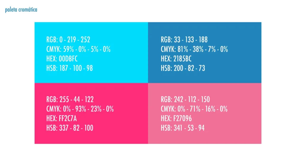
Exact production-ready values.
FIGMA · LICENDI BRAND BOOK · AUTHORIZED USE
Product: responsive e-commerce
L-P1 · 04/10 Discovery

Mobile
FIGMA · LICENDI · AUTHORIZED
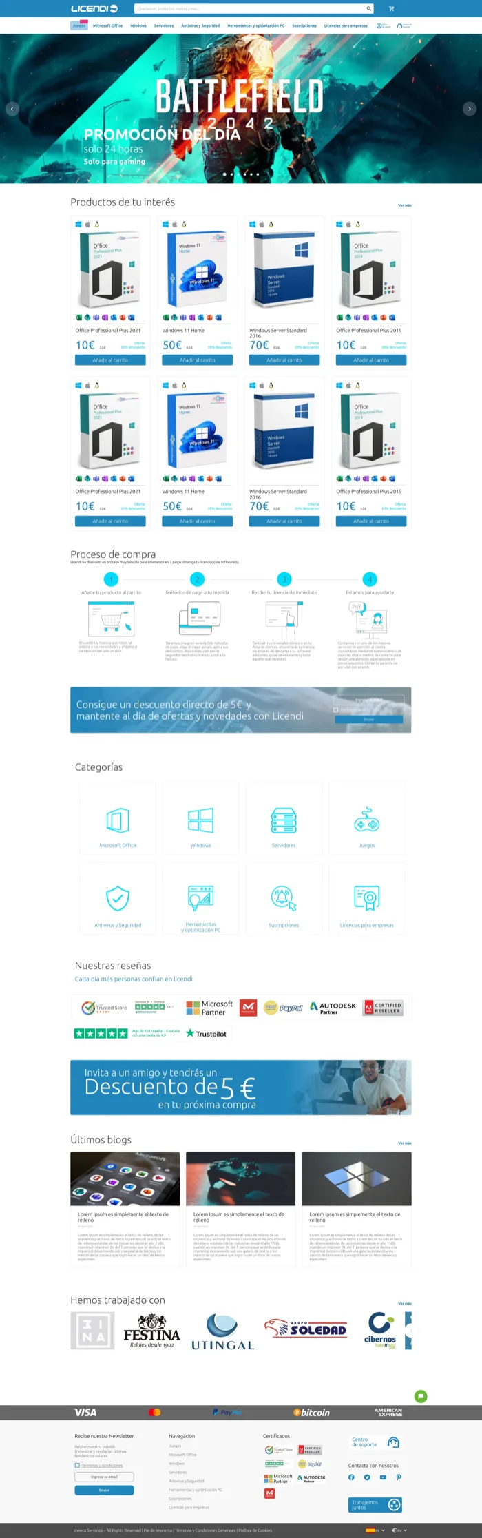
Desktop
SOURCE · FIGMA LICENDI PROJECT · AUTHORIZED USE
Home / landing
The home page organizes the promotional banner, featured products, purchase process, and categories into a single entry view.
L-P2 · 05/10 Evaluate

Mobile
FIGMA · LICENDI · AUTHORIZED
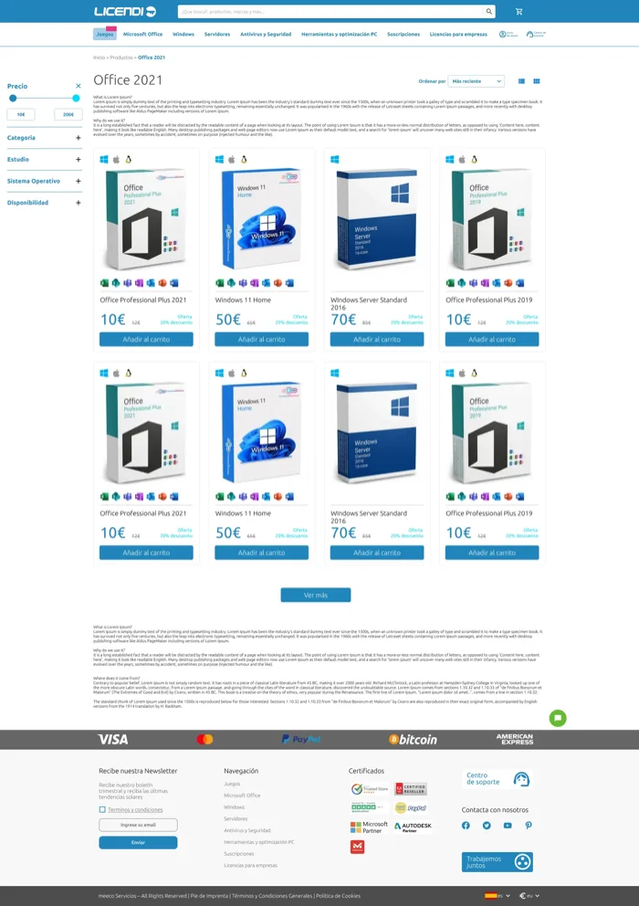
Desktop
SOURCE · FIGMA LICENDI PROJECT · AUTHORIZED USE
Catalog and categories
Filters and the product grid help compare options within a large category.
Explore additional evidence
Research and UX/UI audit
L-R2 · 06/10 Findings and recommendations
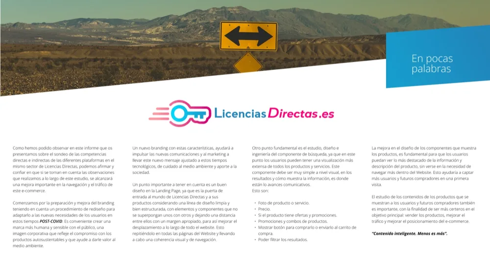
Executive summary that guided the redesign.
FIGMA · LICENDI PROJECT · AUTHORIZED USE
Brand system (rebranding)
L-B3 · 07/10 Typographic family
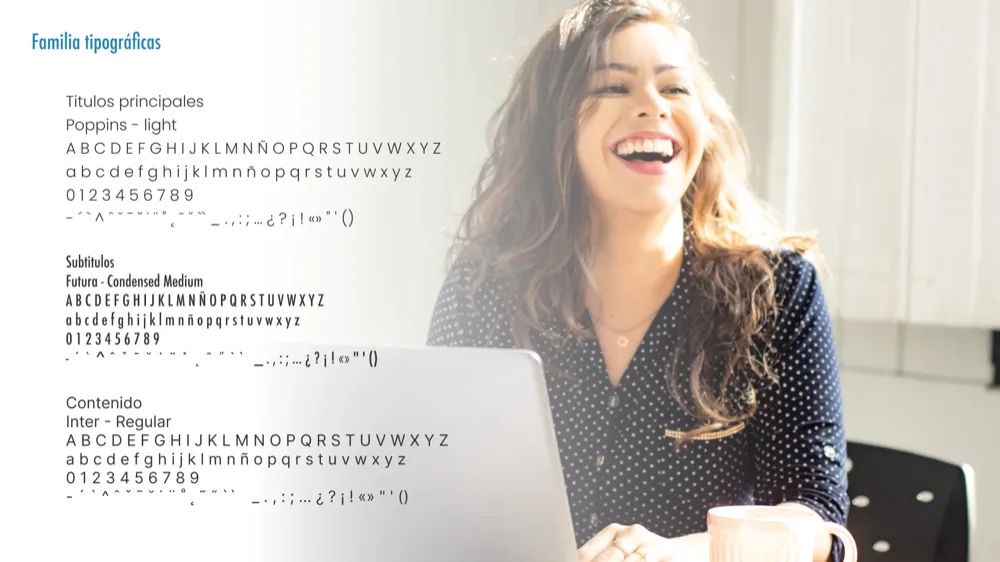
The brand's complete typographic system.
FIGMA · LICENDI BRAND BOOK · AUTHORIZED USE
Product: responsive e-commerce
L-P3 · 08/10 Purchase decision

Mobile
FIGMA · LICENDI · AUTHORIZED
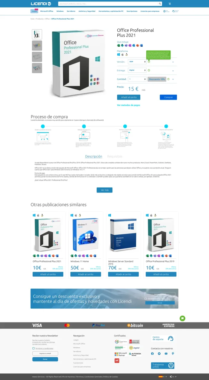
Desktop
SOURCE · FIGMA LICENDI PROJECT · AUTHORIZED USE
Product detail
The product page concentrates the decision variables (version, platform, quantity) before the cart.
L-P4 · 09/10 Review

Mobile
FIGMA · LICENDI · AUTHORIZED
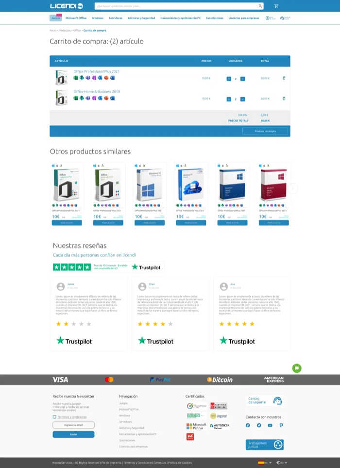
Desktop
SOURCE · FIGMA LICENDI PROJECT · AUTHORIZED USE
Shopping cart
The cart allows adjusting quantities and reviewing the total before moving to payment.
L-P5 · 10/10 Purchase completion

Mobile
FIGMA · LICENDI · AUTHORIZED
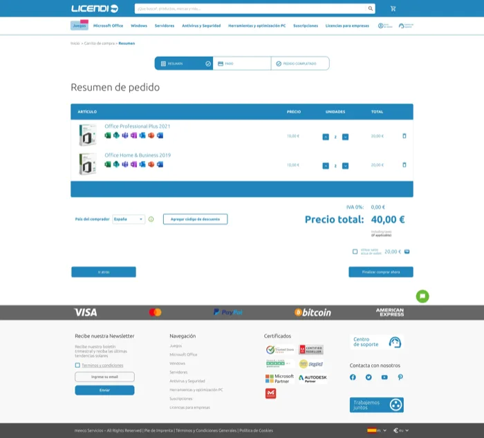
Desktop
SOURCE · FIGMA LICENDI PROJECT · AUTHORIZED USE
Checkout / payment
The order summary confirms items, total, and buyer country before payment.
DOCUMENTED COVERAGE
- 15
- real, agency-authorized screens
- Desktop + mobile
- documented design surfaces
- End-to-end
- journey from home through checkout
- Research + Brand + Product
- treated as one connected system
WORK OUTCOME
An integrated direction for product, brand, and purchasing experience
The work consolidated a direction connecting diagnosis, information architecture, e-commerce journeys, visual direction, and responsive behavior. The demonstrable value of the case lies in the breadth and coherence of the documented decisions—not in commercial metrics that were not verified for publication.
Declared limitations
No conversion, sales, traffic, or engagement metrics are published. The images shown are authorized pre-final iterations for portfolio publication; they do not reproduce the client's final approved delivery. This case does not claim production-code implementation, accessibility compliance, or ownership of the current experience. The current product may have evolved after my involvement; the live website reflects later work by its teams.
References and related work
The current website is provided only as a public reference for a product that has continued to evolve. The related MEECO case documents a different challenge developed within the same professional collaboration and business context.
Design work completed during a professional engagement. The images shown are authorized pre-final iterations for portfolio publication; they do not reproduce the client's final approved delivery. Trademarks, content, photography, and third-party assets belong to their respective owners. The current product may have evolved after my involvement.